
How has road use changed in London? Thanks to ITO World, we can see how the city has been transformed in the last decade.
The transports specialists have mapped the Department for Transport's key road mapping data for London, and it shows an interesting picture. This is the data recorded by traffic counters at points on the city's roads - you can read a bit more about the data here. It basically records:
Annual Average Daily Flow (AADF) and traffic data for every junction-to-junction link on the 'A' road and motorway network in Great Britain
It shows pretty clearly how vehicle use in the city has gone down fundamentally in nine years since 2001 - except for huge increases in cycling and bus/coach use.
It also shows how for sectors such as light industry, the economic force of having to drive into the capital trumps how difficult it is or the shape of the congestion charge.
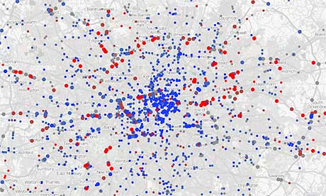
ITO World has given us these maps - click on the images below to see them full size. What do you think they tell us?
Car use
Cycling
Buses and Coaches
Light commercial vehicles and vans
Lorries and other HGVs
Download the data
• Download the full spreadsheet from data.gov.uk
NEW! Buy our book
• Facts are Sacred: the power of data (on Kindle)
More open data
Data journalism and data visualisations from the Guardian
World government data
• Search the world's government data with our gateway
Development and aid data
• Search the world's global development data with our gateway
Can you do something with this data?
• Flickr Please post your visualisations and mash-ups on our Flickr group
• Contact us at data@guardian.co.uk
• Get the A-Z of data
• More at the Datastore directory
• Follow us on Twitter
• Like us on Facebook
